Hero Slider
Section Hero Slider is a dynamic interface element that allows you to display multiple rotating Hero images in the most prominent position on your website. Instead of just a static message, Hero Sliders offer the ability to tell multiple stories, promote a variety of products/campaigns, and create an engaging interactive experience at first sight.

1. How to access the Hero slider section?
Step 01: From Shopify Admin, click on Online Store > Select Themes > In the Current theme section, click the Customize button.

Step 02: In the theme editor (Customize), click the Sections button > Click the Add section button > In the Sections tab, scroll through the list or use the search bar to find and select the Hero slider section.

2. How to customize the Hero slider section?
2.1. Slide block
To add a Slide block to the Hero slider, click the Add Slide button (plus icon ➕) under the Hero slider.
After adding the Slide block, you can adjust its settings using the sidebar—located on the right or left side of your screen depending on your device
Slide image: Upload or select the main image for this slide. This will be the background image displayed on larger screens like desktops and laptops.
Image mobile: Upload or select a separate image optimized for mobile devices. Using a different image for mobile ensures it displays beautifully and appropriately on smaller screens, avoiding awkward cropping or excessive shrinking
Content alignment (Align Left, Align Center, Align Right): Select the horizontal alignment for all text content (Subtitle, Heading, Subheading) and buttons within the slide.
Subtitle: Enter a smaller secondary line of text, often appearing above or below the main Heading
Heading: Enter the main headline for the slide. This is the most crucial message, usually appearing largest and most prominent to grab attention.
Subheading: Enter a brief descriptive text or more detailed message. The Subheading provides explanatory information for the Heading, encouraging users to delve deeper.

Button text: Enter the text that will appear on the button. This is the main message you want users to read and understand when interacting with the button
Button link: Select or enter the link (URL) that the button will navigate to when clicked. You can choose an internal page (product, collection, static page) or enter an external URL.

2.2. Hero slider section
You can configure some general options for the section below:
Section Layout: Choose the layout style for the section containing the slider
Section Width: Set the maximum width for the content within this section (Full width or Boxed)
Image height: Adjust the height of the images within the slider on desktop devices. You can set a fixed value, adapt to image, adapt to first image, fill screen height
Fixed height (desktop): Enter a fixed height value for the slider on desktop devices (e.g.,
500px). This setting is only effective when "Image height" is set to Fixed heightMobile image height: Adjust the height of the images within the slider on mobile devices. You can set a fixed value, adapt to image, adapt to first image, fill screen height
Fixed height (mobile): Enter a fixed height value for the slider on mobile devices (e.g.,
300px).Enable autoplay: Turn on this option to make the slider automatically cycle through slides after a set duration.
Transition speed: Set the duration of the transition between slides (in milliseconds). This is how fast one slide fades out or slides in to make way for the next.
Show navigation (prev/next arrows): Display navigation arrows (previous/next) on either side of the slider, allowing users to manually switch slides.
Show dots (pagination): Display indicator dots (pagination) at the bottom of the slider. Each dot represents a slide, and users can click them to jump to a specific slide.
Slider Padding (px): Add padding inside the slider, creating space between the slider's edges and its internal content
Pause autoplay on hover: Pause the autoplay feature when the mouse cursor hovers over the slider area. Autoplay resumes when the cursor moves away.
Transition effect: Choose the transition effect between slides. Common options include
Slide(slides across) andFade(fades in/out),...Transition direction: Select the direction of movement for the slides
Enable drag on desktop: Allow users to drag the slider with their mouse on desktop devices to navigate between slides.

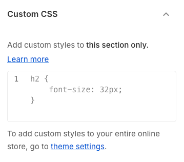
Custom CSS
Allows users to customize by adding CSS rules, beyond the limitations of default settings. This allows for fine-tuning the design to every detail, to suit specific needs.
Add custom styles to this section only.
To add custom styles to your entire online store, go to Theme settings for detailed instructions.
Last updated
Was this helpful?